Research and insights
To ground the redesign in user needs and market context, I explored moodboards, conducted a competitive analysis, and ran user interviews and usability tests. This process helped me understand how the values of Clarity, Trust, and Playfulness resonate with users and guided the direction of both the branding and UI design.
The color palette: balancing trust and personality
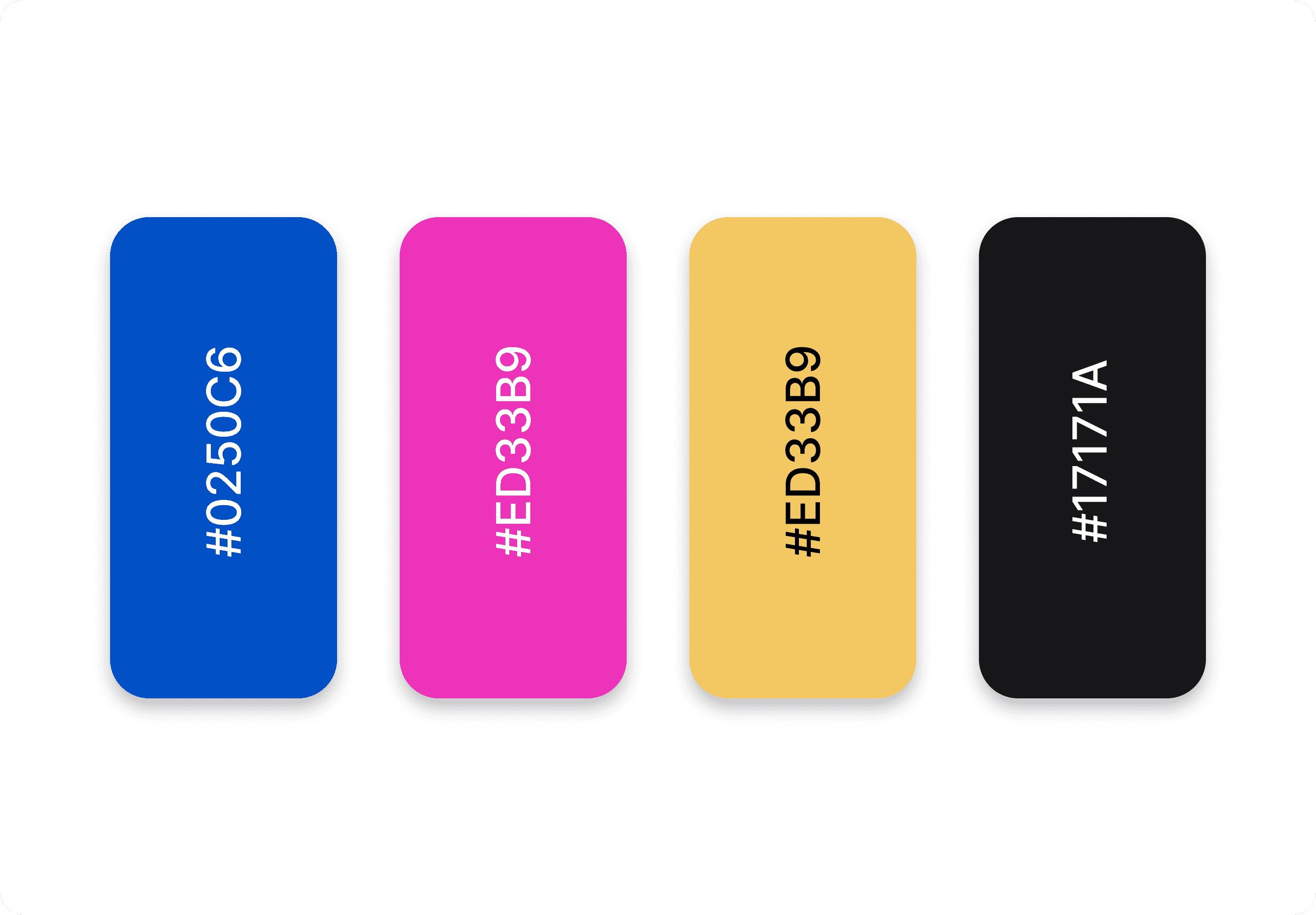
The color palette was designed to reflect the brand values by balancing familiar trust signals with a fresh, playful touch. Blue tones were chosen to convey reliability and security, while pinks and bright gradients introduced a sense of approachability and playfulness. The blend creates a modern, inviting aesthetic that feels both credible and distinctive, aligning with the experience users expect from a challenger bank.
Typography
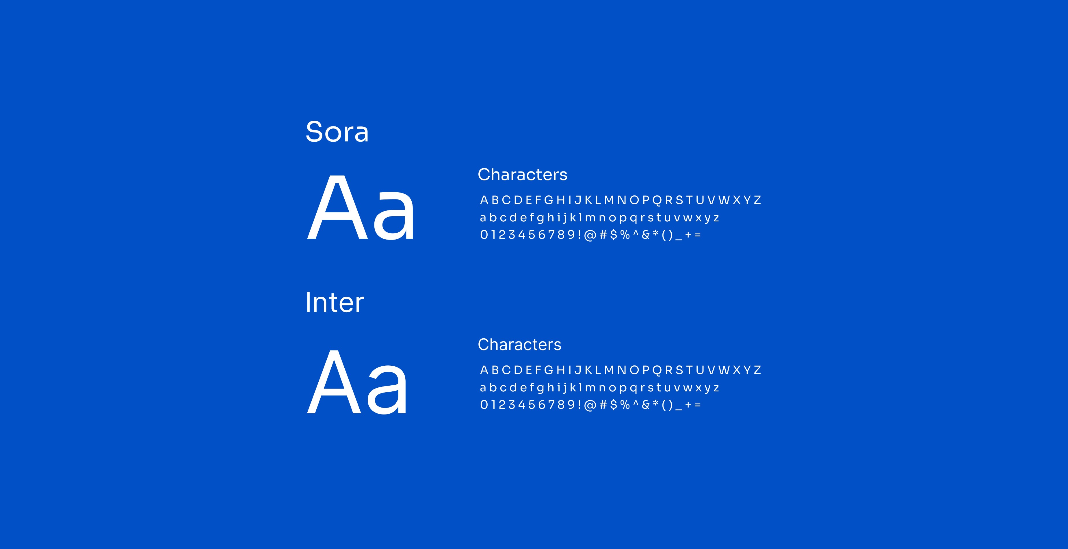
The typography combines Sora for headings and Inter for body text to support both clarity and personality.
Sora, with its geometric shapes and slight softness, adds a contemporary and approachable feel to headings, capturing the brand’s playful edge.
Inter was chosen for body text due to its high legibility and versatility across screen sizes, ensuring a smooth and accessible reading experience. Together, they create a clear visual hierarchy while reinforcing the brand’s values of Clarity and Playfulness.
Design execution and iterations
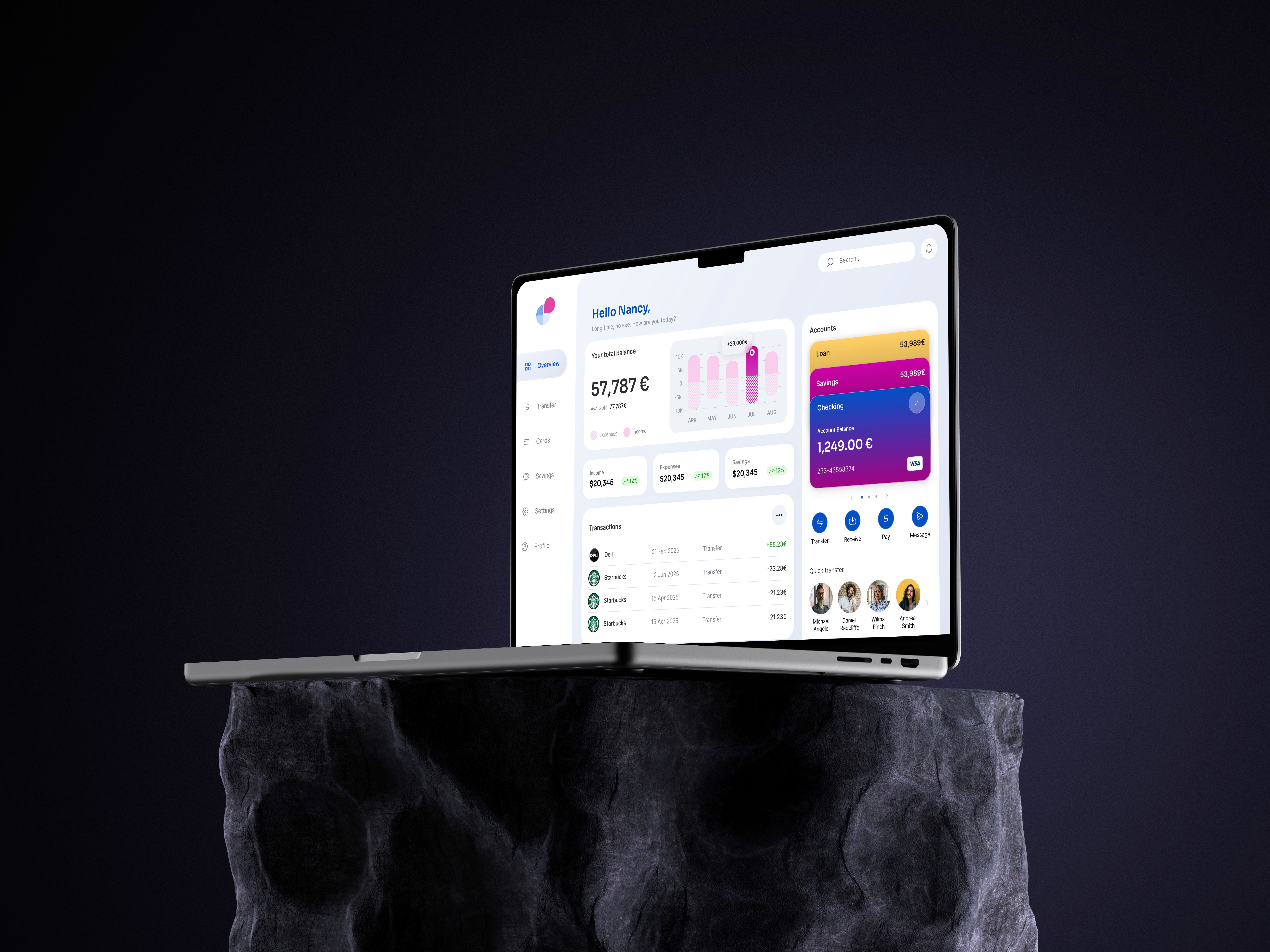
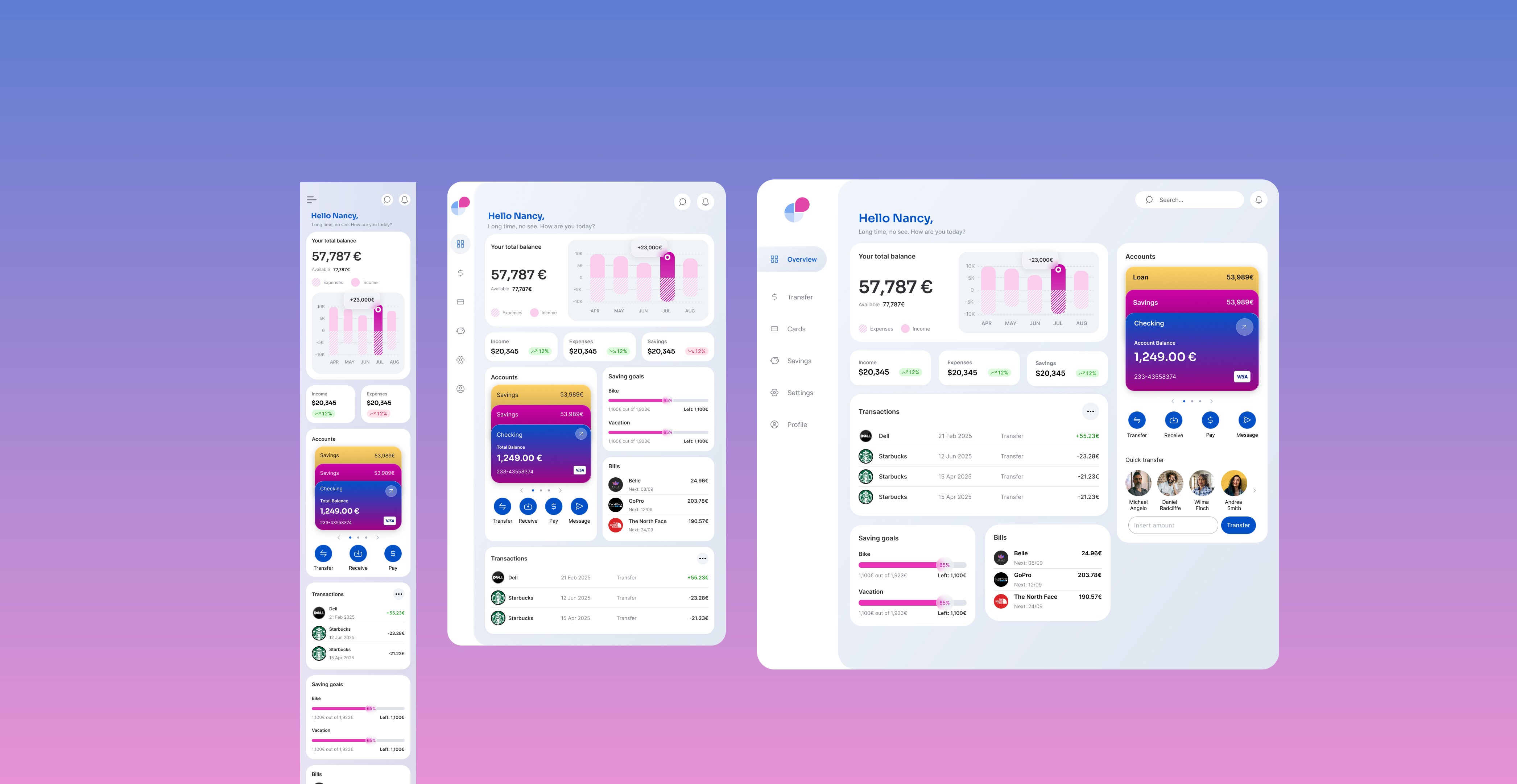
To ensure a seamless experience across devices, the UI was designed responsively for desktop, tablet, and mobile, with three key screens adapted to each format, totaling 9 screens. For each screen, the layout and interaction patterns were adjusted to maintain usability and consistency while optimizing for the specific context of use on each device.
Visual exploration
Initial color choices leaned heavily on traditional blue tones. After user feedback and further visual exploration, more playful tones and gradients were introduced to better reflect the brand's personality and improve emotional engagement.
Flow and function
The transfer CTA was moved next to the account list to streamline the flow. This reduced unnecessary clicks and aligned better with the user’s mental model, since a transfer requires immediate account selection.The cash flow section was redesigned with a condensed layout, allowing users to view more information at a glance. This change maximized space without sacrificing clarity, improving usability, especially on smaller screens.
Responsiveness
The interface was designed with full responsiveness in mind, adapting seamlessly across desktop, tablet, and mobile for all three core screens. Layouts were adjusted to prioritize key actions and information on smaller screens, ensuring usability without compromising functionality.
Reflection
This project was a rewarding challenge that required balancing brand personality with functional clarity. One of the trickiest parts was finding the right tone between playful and trustworthy. After early feedback that the design felt too vibrant and off-brand for a bank, I toned things down, only to later realize I had gone too far in the opposite direction, making the interface feel bland and overly serious. Through several iterations, I gradually arrived at a balanced visual tone that felt both approachable and credible.
On the functional side, rethinking the layout and CTA placement made a big difference. Moving the transfer button next to the account list reduced clicks and aligned better with how users actually move through the flow. I also restructured the cash flow section to surface more information in a compact view, improving overall usability.